In what ways does your media product use, develop or challenge forms and conventions of real media products?
Hello and welcome to my blog. The brief for the A2 course is to produce a portfolio of productions: a music video as my main text, plus a digipak cover and a magazine ad for the digipak. Although we have to research the codes and conventions of music videos we have a creative freedom to make an original, eye catching video. Feel free to have a look around my blog and don't be afraid to leave any comments on any of my posts. Thanks!
Friday, 27 April 2012
Monday, 23 April 2012
SP - Evaluation Question 2
How effective is the combination of your main product and ancillary texts?
Here is part two of my second evaluation question that is a Prezi PowerPoint Presentation. Simply view as a slideshow, or alternatively hold the
mouse and drag to scroll around.
Friday, 20 April 2012
SP - Evaluation Question 3
What have you learned from your audience feedback?
Here I have used the YouTube annotation tool to dicuss some audience feedback I gained on our latest rough cut (Sample Footage 7) from our target audience which in this case was my A2 Media Studies class.
Here I have filmed our secondary target audience giving us feedback on our lastest rough cut (Sample Footage 7) that was uploaded to YouTube
Wednesday, 18 April 2012
SP - Evaluation Question 4
How did you use new media technologies in the construction and research, planning and evaluation stages?
Monday, 16 April 2012
Sunday, 15 April 2012
ALL - Final Digipak Cover
We now have a completed Digipak which can be seen below:
Front Panel (and spine)
Back Panel
Front Panel (and spine)
Back Panel
Inside Panels
Thursday, 12 April 2012
Wednesday, 11 April 2012
Monday, 9 April 2012
WS - Our Two Magazine Adverts


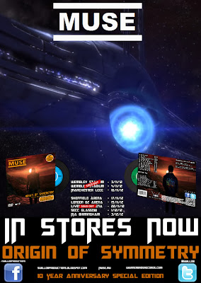
- The background image on magazine advert 1 is a screenshot from the game Mass Effect. While we thought that this looked quite appealing, it is arguably more suitable for our secondary audience as the link to the gaming aspect of our video is heavily emphasized in the background image. Apart from that, it seemed to be very positively received and therefore something that we wanted to persevere with. To allow us to keep this advert we decided to create another one that would be tagged as the "main advert" and would hopefully be more appealing to the Primary Target Audience.
- This wasn't the only problem with advert 1, however. Because the background is an unedited screenshot from the game 'Mass Effect' it isn't really our image and therefore in breach of copyright. The second advert is completely our own and shows an image that we created ourselves completely.
Target Audiences
Both magazines are targeted at a specific audience, with Mag Ad 1 being targeted at our secondary target audience (25-40, predominantly males) and Mag Ad 2 being targeted at our Primary Target Audience (15-24, again predominantly males).
Mag Ad 1
When designing the first magazine our intention was that this would be aimed at our primary target audience. However following feedback from the class we found that people felt it would appeal specifically to people who enjoy gaming due to the obvious links with that part to our video. The average age of gamers in the UK is around 35-40 and is therefore part of our secondary target audience. We didn't want to get rid of this advert completely however as the feedback received was generally very positive. We also felt that this advert would still appeal to any fans of the band as it incorporates a sci-fi type theme which is very common in videos and products from Muse.
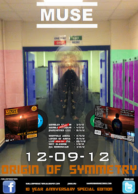
Mag Ad 2
Due to the feedback we received we decided to create another magazine advert aimed more precisely at our Primary Target Audience. For this we left many of the conventions the same and the layout very similar, with the major alteration being the change in background. We felt this reflected the different audience, our video and a theme that will appeal to our primary target audience. The themes common between our video and this image include the isolation of the protagonist and the distortion of his mind, shown here through the use of layers. We feel that this, added to the first magazine ad and the different themes shown there, we cover a whole range of themes from our video and themes that are commonly used by the Muse band, and therefore areknown to be successful in the industry and with our target audience in particular.
Similarities and Differences
Similarities
Despite the adverts having different target audiences there are still quite a lot of similarities between the two:
- A number of conventions of magazine adverts are present in both, examples including the name of the band being central and bold at the top, a picture of the digipak (the product it is advertising), tour dates, the name of the album and release dates
- The layout of the two products is very similar, with only things such as wording changed.
- Both adverts make use of a particular theme from our video (although different themes in each advert).
- Both adverts have a sci-fi type feel to them.
- Both adverts include the Facebook and Twitter logos, as well as web adresses for the band and production company.
- Both adverts include the same tagline (10 Year Anniversary Special Edition).
There are also a number of differences between the two adverts:
- The differing background image is obviously the key and glaring difference between the two. We feel and hope that this can ensure we target different audiences, advert two for our primary target audience with the first advert for our secondary audience.
- The date for release ("In Stores Now" for Advert one & "12-09-12") shows two different styles that we have seen from magazine adverts we have looked at - one worded and one numerical.
- The theme that each advert is based on is different. Advert 1 is based on the sci-fi/gaming aspect whilst Advert 2 is based more on the ideas of isolation and distortion of the protagonist's mind.
Subscribe to:
Comments (Atom)


