 |
| Our Magazine Advert |
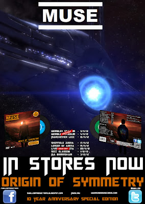
As stated in the post regarding our digipak, there is a couple of themes that we tried to keep running throughout all three of our products to link them together. One of these themes is gaming. The background to our Magazine Ad is a screenshot from Mass Effect which is the same game that we have taken a screenshot for for our Digipak. This links in with the whole theme of gaming that is present through all three products, but is clearly shown through the video format. This is the clearest link between our magazine ad and the video.
The picture of the Digipak on our magazine ad is another link between all three products. The Digipak contains our music video and displaying it on the magazine ad links them all together.
Another key theme that we tried to get running throughout all the different parts of the package is the idea of isolation. This is a huge and key part to our music video, though it proved quite tough to transfer this to our magazine ad. We had an idea where we split a picture of the protagonist in half so that it was half real person, half avatar to show how that is a major part of his life and his desire to be like the avatar. For a number of reasons however, this wasn't possible. We still feel like the space aspect of the background for the magazine ad works in a similar way to show isolation though. Space is obviously a large open space with no known human life which signifies the loneliness and isolation aspect within our video.
No comments:
Post a Comment
All comments are moderated.